

World images, I want your opinion.
 MBY
Member Posts: 74
MBY
Member Posts: 74
Hi, I am working in my project and I want your opinion about my world images:
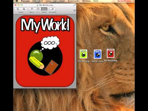
In "My World" you create your levels
In "My World" you create your levels
Comments
Ace