

Feedback on my attract screenshots please?
 PixelPun
Member Posts: 324
PixelPun
Member Posts: 324
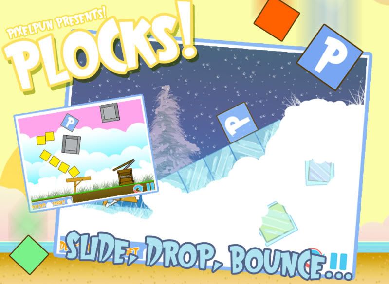
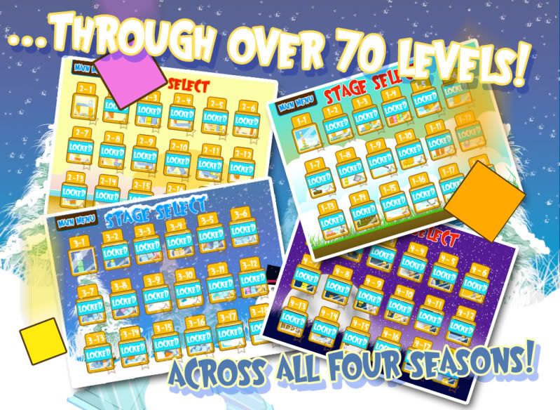
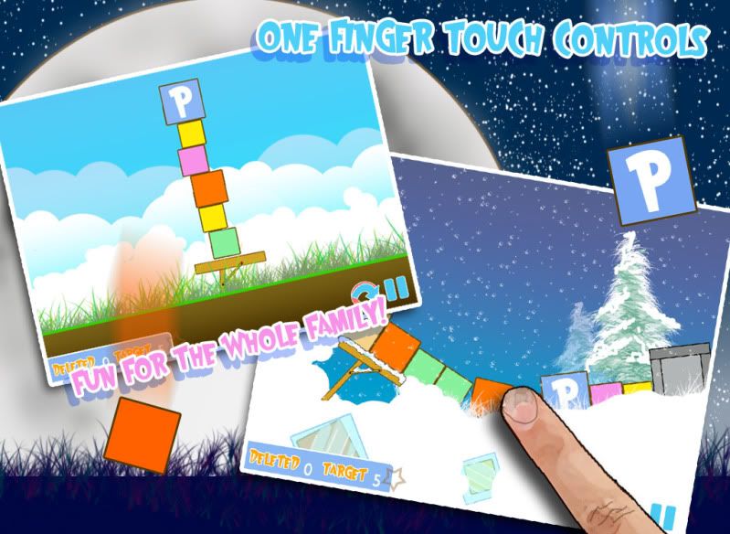
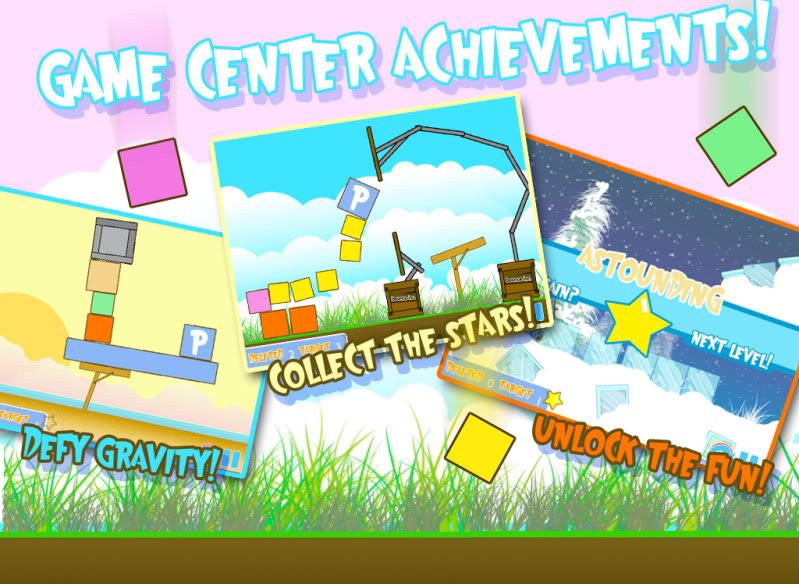
So I'm hoping to put out my first game this June and I thought I would work on some attract screenshots, they still need some work... I'm still not in love with all the wording and such... I just wanted to get some opinions and see if I'm on the right track with these things.
Thanks everyone for the help!
Rob
Thanks everyone for the help!
Rob
Answers
Looks really good!
@xforce I spent like three days trying to improve on those blocks, I made them look like cloth with different patterns, I tried a watercolor style. At the end of the day I just decided to leave them simple because it is a simple game. I did though at that time go into the backgrounds of the levels and make them pop more. But I do agree... more could be done with the blocks... I just kinda want get this thing out there and start on something new!