Ok Guys.... What's Wrong With my App Store Icon (feedback appreciated)

goliathgoliath Member Posts: 1,440
edited July 2012 in Working with GS (Mac)
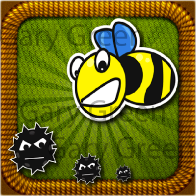
What do you guys think about the following app icon. I am still in the prelim. stages of my new game but I needed a little rest and wanted to work on the icon. Let me know what you would do to improve. Thanks!
image

Comments

  • goliathgoliath Member Posts: 1,440
    No clue why you have to scroll down to look at it...
  • lycettebroslycettebros Member, PRO Posts: 1,598
    Make the details bigger - those tiny black things will almost invisible on an iphone menu screen.
    The Bee character is too small - it has the most potential as an iconic object for the app/game. Make it bigger and fill the icon space.
    Not sure about the patterned background or edge....maybe too detailed. Do they mean anything related to the game? If relevant I would use a honeycomb effect in the background if it is relevant to the game.
  • goliathgoliath Member Posts: 1,440
    PERFECT! Thanks! I just threw this together quick and I am thankful for the feedback.
  • tenrdrmertenrdrmer Member, Sous Chef, Senior Sous-Chef Posts: 9,934
    I dont like the real textures in the back and then Vector looking stuff in the front. It just looks very off to me.
  • hotMagichotMagic Member, PRO Posts: 266
    I think you're on the right track. It's just more suitable for a big image. Like someone said above, those HD textures won't read in a small format. And in addition, I'd up the contrast of those rays in the background, make the yellow more bright, and make the bee larger. (all things that have to do with the size on a phone)
  • jonmulcahyjonmulcahy Member, Sous Chef Posts: 10,408
    download this photoshop template so you can easily see how an icon will look at all used sizes. I think that one is a little too detailed, it'll all get lost at 57x57:

    image

    when designing an icon, you really need to design of 512x512 and 57x57 at the same time.
  • creativeappscreativeapps Member Posts: 1,770
    edited July 2012
    Forget about how it looks in 512x512(iTunes Submission size), 57x57(Non Retina Device Size)
    or 114x114( iPhone Retina Device Size)

    Important is to check in 175x175(iTunes App Profile Size) & 75x75(iTunes App Listing Size)

    Feedback:
    Color combinations of current icon is not proper specially background contrast
    Bug or creature types of black circle objects are not looks proper. They are mixup with background
    I can see cloth patterns in background only in 512x512 size how does it looks in 75x75 & 175x175 size?
    You can change the bee expression as per its role in game play
    Overall brightness, richness of the icon is missing

    Very Very Imp: User can not judge the game play from the icon

    For example Cut The Rope display Catch Candy so If possible highlight that

    And agree with @tenrdrmer with he said.

    Thanks,
    John
  • goliathgoliath Member Posts: 1,440
    Thanks again. I will have an updated version soon (hopefully)
  • EatingMyHatEatingMyHat Member Posts: 1,246
    Textures are not visible on the icon at small size and will make it look blurry and unprofessional. Put more focus on the characters, unless the rope is in the game, it has no place being there (even as a border).
Sign In or Register to comment.