Need Opinion On App Icon

gamesfuagamesfua Member Posts: 723
Hey all, I'm about 2-3 weeks away from beginning the app launching process. I've made a few potential app icons for my game. I'd love to get your opinion on which one you like better and or if you have any suggestions. I love feedback- so you can be as harsh as you want (just hopefully be constructive). I want the app icon to demonstrate an inviting, warm, friendly, cute, environment. I'd also like to keep the name of the app off of the icon. I kind of like it nice and clean. But I'm curious to your thoughts and why. Thanks so much!

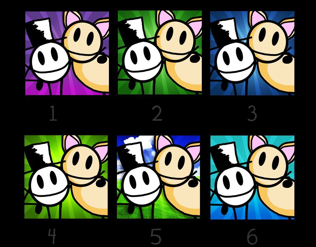
P.S. I'd ignore number 5. I definitely don't want a busy background.

image

Comments

  • DeadlySeriousMediaDeadlySeriousMedia ArizonaMember Posts: 838
    I like 4 and 6.
  • gamesfuagamesfua Member Posts: 723
    @deadlyseriousmedia thanks! I'm partial to the green ones myself.
  • gyroscopegyroscope I am here.Member, Sous Chef, PRO Posts: 6,598

    Hi @anatomyofdreams Nicely done design! :-) My eyes were immediately drawn to no. 6, if that's any help to you.
  • RPRP Member Posts: 1,990
    6 has the right "pop".
  • gamesfuagamesfua Member Posts: 723
    @gyroscope many thanks! Appreciate it! Okay it appears that 4 and 6 are the more popular ones. I had asked this same question on facebook and the results were similar. I don't know why but my eye keeps going back to the green. Tough.
  • DeadlySeriousMediaDeadlySeriousMedia ArizonaMember Posts: 838
    If I had to choose between 4 and 6 I'd say i prefer 6 to 4. They both pop really well but 6 seems more comforting. It think it's the mixture of blue and green. It's bright without being loud.
  • gamesfuagamesfua Member Posts: 723
    Noted @deadlyseriousmedia, thanks!
  • RPRP Member Posts: 1,990
    edited January 2013
    Not to mention what the color means. The green is very mystlike and murky or suggests a bright green light emitting from behind (mysterious, scifi or horror). The blue is more "blue skys" happy, fun and warmer (even when these colors do not neccesarily sugget warmth).
  • gamesfuagamesfua Member Posts: 723
    @RP VERY VERY solid point! That makes a ton of a sense.
  • slinky1988slinky1988 Member, PRO Posts: 89
    6 4 3 1 2 5. 6 being the one I like the most, 5 being the one I like the least. Best of luck!
  • ChakkuChakku Member Posts: 1,513
    1st choice is 3; 2nd choice is 4...don't like 6.

    Chakku
  • beefy_clyrobeefy_clyro Member Posts: 5,394
    1
  • Sh4rpSh00terSh4rpSh00ter Member, PRO Posts: 10
    My favorite ones are 2 and 3. They look really clean and just pop with a professional look.
  • goliathgoliath Member Posts: 1,440
    I like 4 and 6 as well. They caught my eye and really pop. They are vibrant and should be good for your game. I hope this helps.
  • HoneyTribeStudiosHoneyTribeStudios Member Posts: 1,792
    1 or 6, the characters stand out more on those backgrounds. But the real test is when at same size as on the iphone app store.
  • gamesfuagamesfua Member Posts: 723
    Good point @honeytribestudios Ive actually placed the icon on my iphone and made itunes mockups, so that i could test its attention factor. Thats one of the reasons why i opted not to put the game title on the app. Too busy. The bright green color in my opinion seems to make the most impact- but thats just me, and why im asking the community. So very good point! Thanks! :)
  • I liked 3, personally
  • tatiangtatiang Member, Sous Chef, PRO, Senior Sous-Chef Posts: 11,949
    I like 6 but I had to shrink down the images to actual icon size to decide that.
  • blorschblorsch Member Posts: 248
    6
  • ChakkuChakku Member Posts: 1,513
    I liked 3, personally
    Me too!

    I liked the dark blue color more than the light blue.

    Chakku

  • gamesfuagamesfua Member Posts: 723
    Thanks guys very helpful!
  • artfishartfish Member, PRO Posts: 369
    6
Sign In or Register to comment.