Red overwhelms the characters. The beige looks better. Orange is also a good Halloween colour.
Maybe only red triangles would be less intense. Not the whole box. Orange triangles? Reducing red alpha with the black background might look less distracting and ghostly..........
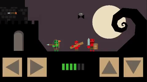
Sorry, @BigDave , but it just occurred to me - the coffee may have not kicked in yet. Why do you have two pairs of identical buttons? Or are you still just prototyping? It can be confusing.
@Toque said:
Red overwhelms the characters. The beige looks better. Orange is also a good Halloween colour.
Maybe only red triangles would be less intense. Not the whole box. Orange triangles? Reducing red alpha with the black background might look less distracting and ghostly..........
These sound like good ideas. I don't love the beige
I like 1 the best. Putting them in small thumbnails like you did with the 8 options is a great exercise because it allows you to zoom out and see all of the elements on your screen, as well as how they feel in relation to one another.
What you learn here is that your buttons are clearly the most prominent thing in the screen. Is that what you want? Your buttons compete pretty evenly with your environment, while your characters are being crushed into irrelevancy.
My suggestion is to go with a grey color, and scale down the buttons quite a bit. Of course, you don't want to introduce any usability issues so you should still keep the clickable areas large. Just reduce the visual real estate they're currently using.
But orange really pushes the halloween theme. Its fun and better than red.
I like the NO square outline box. Cleaner and simple.
The reduced alpha doesn't work for me. Sorry my bad.
Halloween theme I would go with orange.
PhilipCCEncounter Bay, South AustraliaMemberPosts: 1,390
@Adrenaline said:
Your buttons compete pretty evenly with your environment, while your characters are being crushed into irrelevancy.
My suggestion is to go with a grey color, and scale down the buttons quite a bit. Of course, you don't want to introduce any usability issues so you should still keep the clickable areas large. Just reduce the visual real estate they're currently using.
I agree. The buttons are way too big and spoil the scene and dimish the characters.
If the buttons, without a box, were a quarter of the size, and dark as example 9, it would still be obvious to anyone playing the game what they were for. Then your cute little characters would really pop out in the scene.
Is ok. Reminds me of pixel Mage control. But that was pixel and "boxy" design. So squares fit design.
I finished pixel Mage.
I was thinking outline border for triangle with no square. But 4 is good design.
Nothing else has outline.
Keep large area for actual button. Maybe reduce alpha when touched??
Or you could have square outline alpha 0 but when touched outline box alpha 1. Triangle no change. Might be a nice touch button effect?
Clean design but tells player button is larger.
@Toque
thanks!
Yep the alpha around is much bigger, also when I shrinked them I left the total size just decreased the size of the visual. So the alpha is even bigger compared to what is visible.
I do similar usability hacks for collisions, For example the collison of the hero and enemy are much smaller as the visible. Means they have to clearly overlap to damage the player.
But the player projectile has a bigger alpha around so its more likely to hit the enemy.


 BigDave
Member Posts: 2,239
BigDave
Member Posts: 2,239


Comments
red is halloween but maybe to strong, beige is the same as in meat wagon quest so consistent
Red is definitely more halloweeny, but the beige fits better overall in my opinion.
EDIT: Light orange might work too.
A darker version of either might work too. Less distraction. Good luck with it!
thanks guys. I think I go beige. For consistency then.
Red overwhelms the characters. The beige looks better. Orange is also a good Halloween colour.
Maybe only red triangles would be less intense. Not the whole box. Orange triangles? Reducing red alpha with the black background might look less distracting and ghostly..........
Beige looks better to me too.
Sorry, @BigDave , but it just occurred to me - the coffee may have not kicked in yet. Why do you have two pairs of identical buttons? Or are you still just prototyping? It can be confusing.
Edit: Wie war deine reise?")
Some orange should fit perfect
Hm i think I will not go orange and stay consistent with the color beige as it was before but thanks!
@mhedges
yes its still prototype level so jump and shoot button are still placeholders.
Playing as Archer
If you bought the Orcinator it looks more like this
These sound like good ideas. I don't love the beige
ok trying the orange tomorrow
I like the beige
Beige+ maybe darker Orange
Opens the question box or no box beside of the question color.
I still like neutral colors like in 1. It could work without the box but somehow it fits with it to the geometric world too.
without box looks nicer in my opinion. and for colours I would choose 1, 5 or 7.
no box. 1, 6 or 8
Maybe try a dark black/grey box so it's not so noticeable instead of no box. Just an option.
I like 1 the best. Putting them in small thumbnails like you did with the 8 options is a great exercise because it allows you to zoom out and see all of the elements on your screen, as well as how they feel in relation to one another.
What you learn here is that your buttons are clearly the most prominent thing in the screen. Is that what you want? Your buttons compete pretty evenly with your environment, while your characters are being crushed into irrelevancy.
My suggestion is to go with a grey color, and scale down the buttons quite a bit. Of course, you don't want to introduce any usability issues so you should still keep the clickable areas large. Just reduce the visual real estate they're currently using.
Or, you know...not. haha
Nine. You're welcome.
1 or 9
1 or 5
6
All these colours will look vastly different on different people's monitors.
I enjoy #1-3
Thats tough. I like without the prominent box.
1 matches the colour palette.
But orange really pushes the halloween theme. Its fun and better than red.
I like the NO square outline box. Cleaner and simple.
The reduced alpha doesn't work for me. Sorry my bad.
Halloween theme I would go with orange.
I agree. The buttons are way too big and spoil the scene and dimish the characters.
If the buttons, without a box, were a quarter of the size, and dark as example 9, it would still be obvious to anyone playing the game what they were for. Then your cute little characters would really pop out in the scene.
You could try just the outline of the button as well. I'm guessing that might be too minimalist.
thank guys for that amount of feedback.
So as suggested:
-No Boxes
-Try outline around triangle
-decrease button size ( visible only)
-Decided upon 1 as neutral fitting color
Now its only about minimal adjustments, but it looks like we found the right direction here I am pretty happy with it.
Four. 4
I finished pixel Mage.
I was thinking outline border for triangle with no square. But 4 is good design.
Nothing else has outline.
Keep large area for actual button. Maybe reduce alpha when touched??
Or you could have square outline alpha 0 but when touched outline box alpha 1. Triangle no change. Might be a nice touch button effect?
Clean design but tells player button is larger.
@Toque
thanks!
Yep the alpha around is much bigger, also when I shrinked them I left the total size just decreased the size of the visual. So the alpha is even bigger compared to what is visible.
I do similar usability hacks for collisions, For example the collison of the hero and enemy are much smaller as the visible. Means they have to clearly overlap to damage the player.
But the player projectile has a bigger alpha around so its more likely to hit the enemy.
Cheat/round in favour of players.